BRIDGING THE PAST, EXPRESSING THE PRESENT
Serving our community for over half a century, we are the oldest continuously-run Chinese restaurant in southeastern Connecticut. On the occasion of our thirtieth anniversary as the Golden Palace, we've embarked on a multi-phase renovation to continue providing you with the best Chinese dining experience in the region.
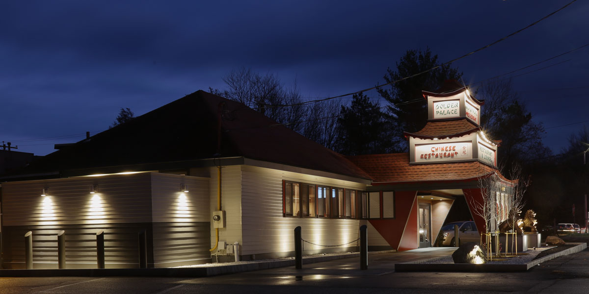
A new inviting entryway, with a row of plum trees buffering the roadway
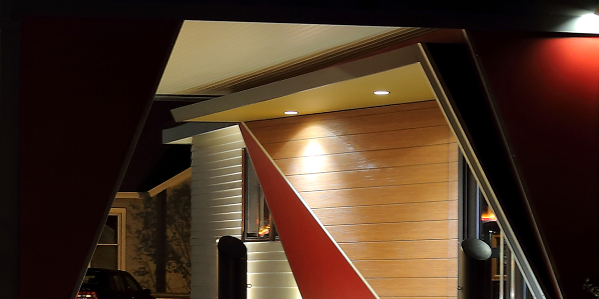
New entry reconciles the symmetries of the former porte cochere with the existing off-centered doorway
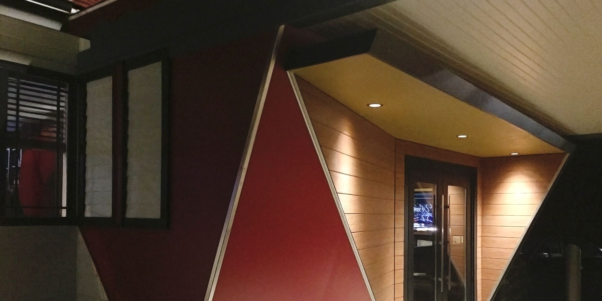
The dynamic forms appear radically different from different approaches. Here, the triangular partitions appear balanced due to the anamorphic projection
Centered on the regular spacing of the extant recessed lighting, angular folded motifs that integrate misaligned walls announce a new threshold
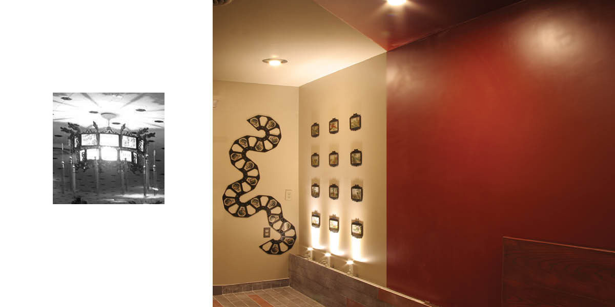
Glass slides from the old dining room lanterns are repurposed to create a grid of frames and a curved motif that references the dining room dragons; Long Dong, or Dragon's Den, is the ancestral village of the Fan family

Economical 4" X 24" wood ceramic tile flooring are combined to create 4" X 48" units. The two-colored tiles gradually reverses positive/negative spatial relationships
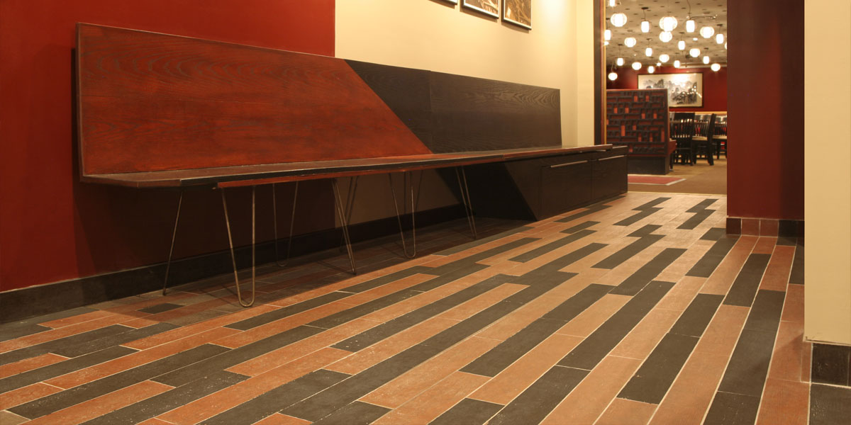
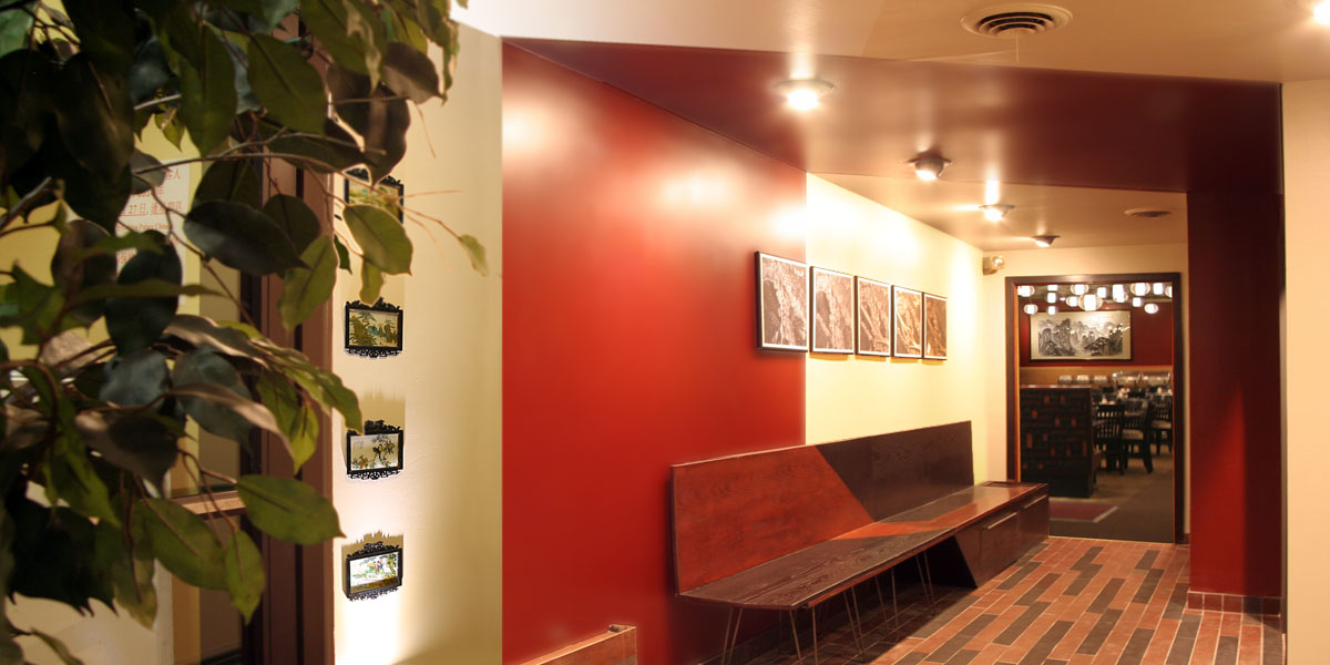
Custom designed banquette provides additional storage. Formally and structurally balancing heavy and light elements, the former stabilizes the latter.
Consistent with the folding motif, the floor tiling wraps along the wall to spatialize surfaces
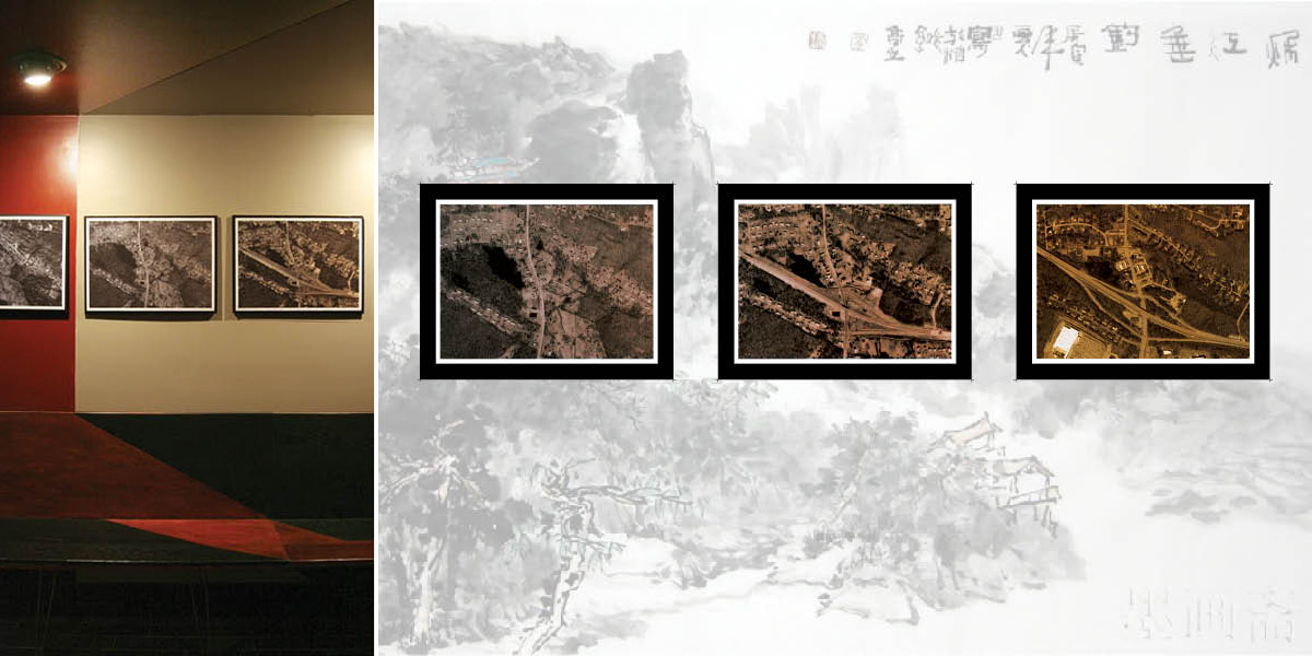
Historic aerial photos of the restaurant site ground the restaurant as a local institution and reference the abstract formal qualities of traditional Chinese landscape paintings
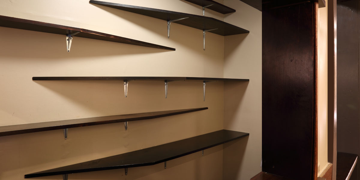
Angular shelving in elevation and plan create angular shadows
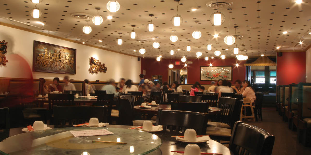
An exploded chandelier: a field of lights that refrence Chinese lanterns unifies the central dining space and allows for the free placement of furniture
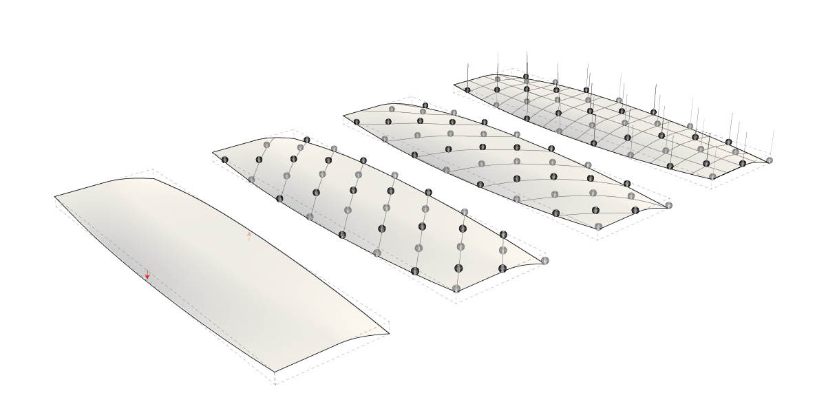
The exploded chandelier conforms to a doubly curved surface.
The silver and bronze lanterns create different patterns (single colored/alternating colored) depending on one's perspective
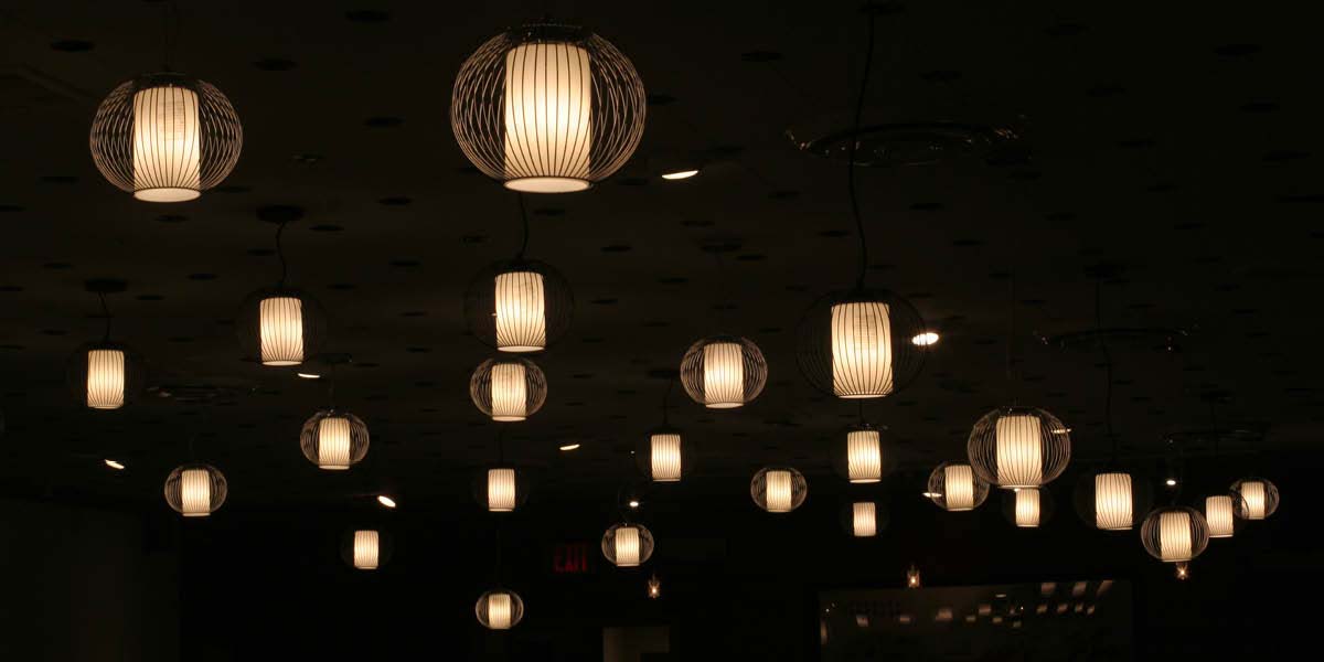
Multiple alignments and patterns emerge from the implied surface
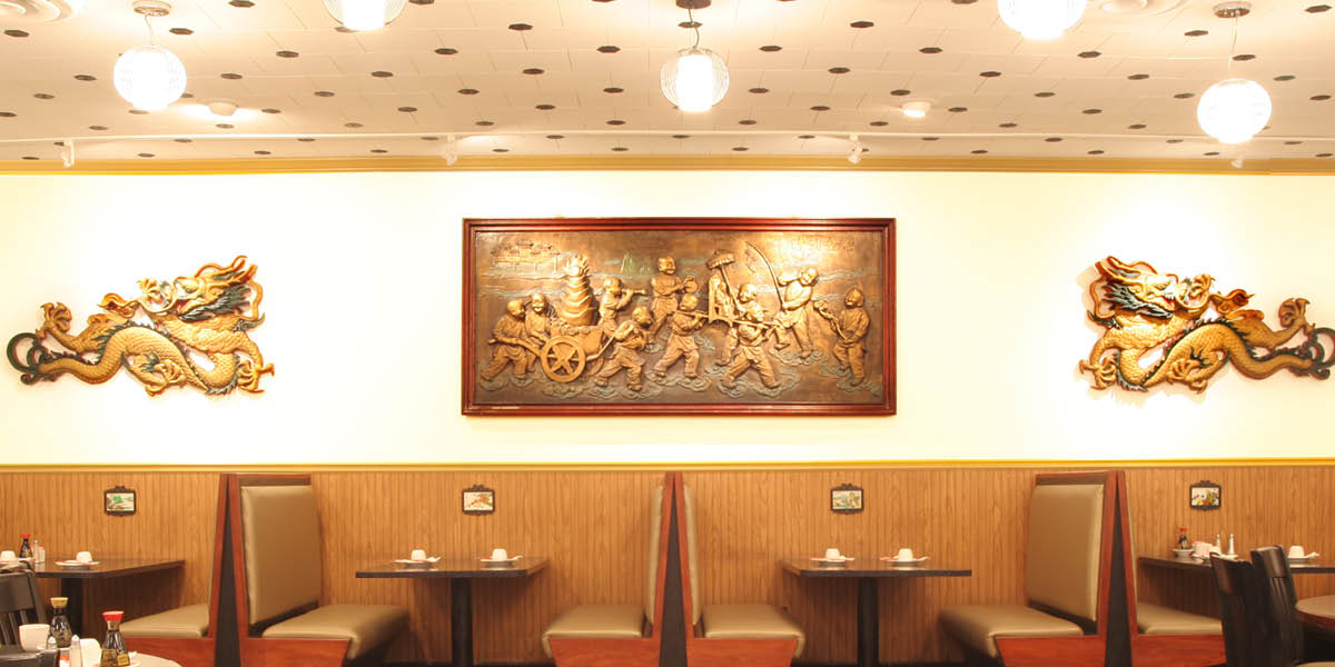
Custom booths create a streamlined appearance while reducing the perception of its bulk
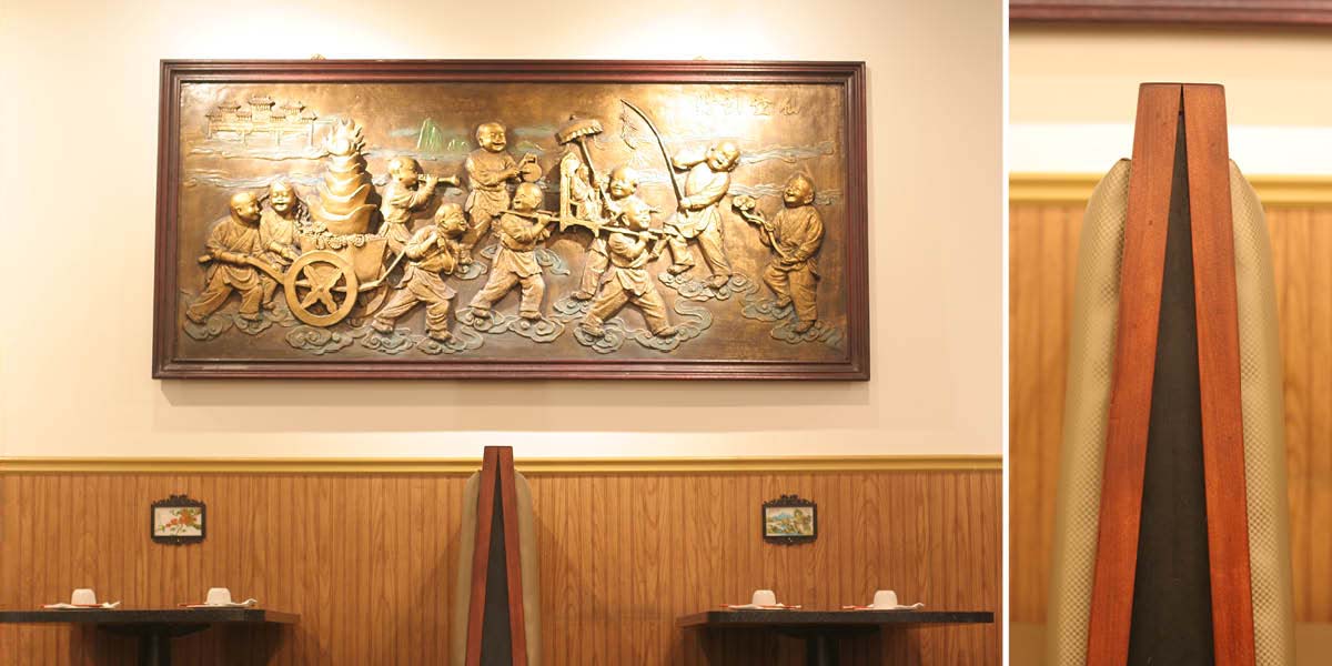
The high relief and black stain of the booth edges create shadow effects to further reduce the booth's bulk
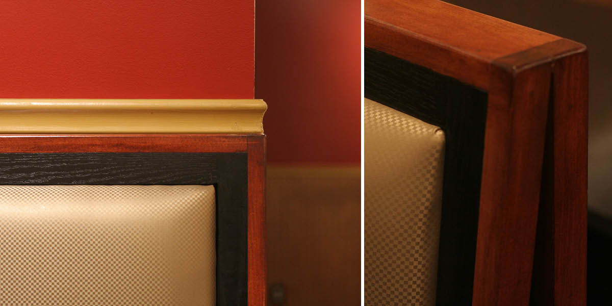
The different wood stains differentiate the frames from afar. The maple and oak wood grains differentiate the frames upclose
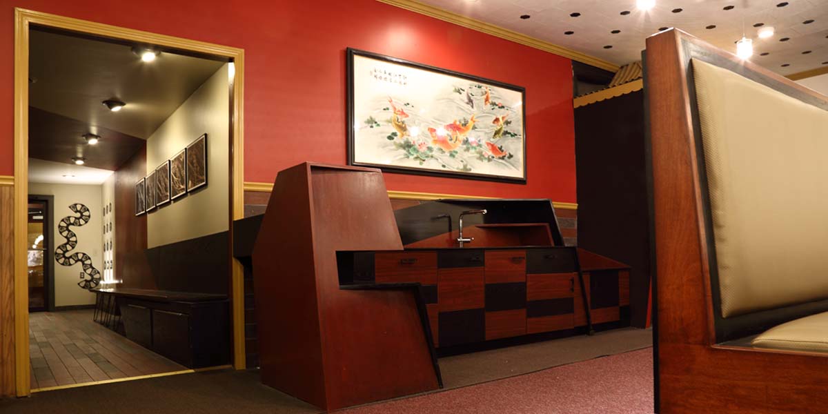
New host-wait station mimics the forms of the main entry
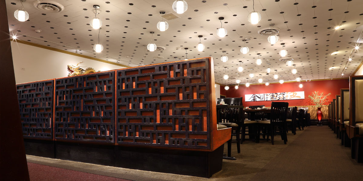
Trellis references traditional Chinese screens but with a contemporary pixelated expression
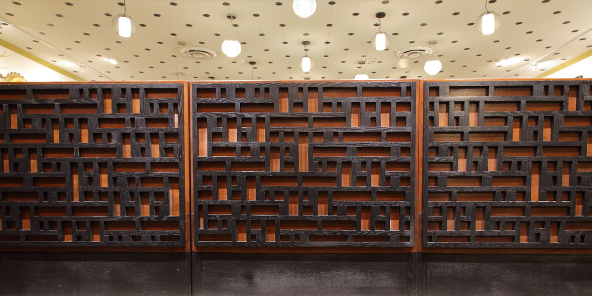
The trellis depth allows patterns of light and shadow to emerge
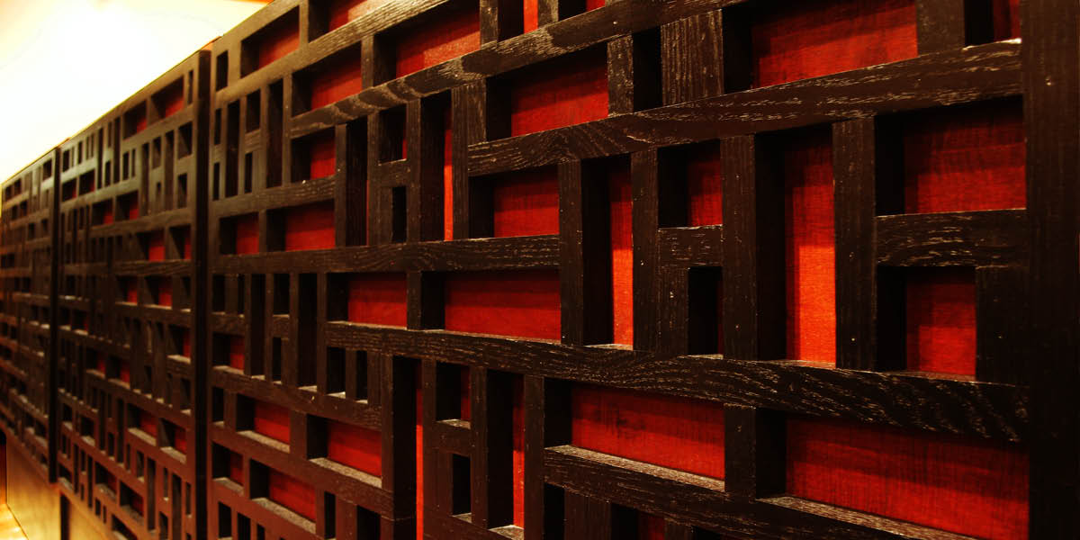
From an oblique view, the long horizontal spaces form diagonal axes
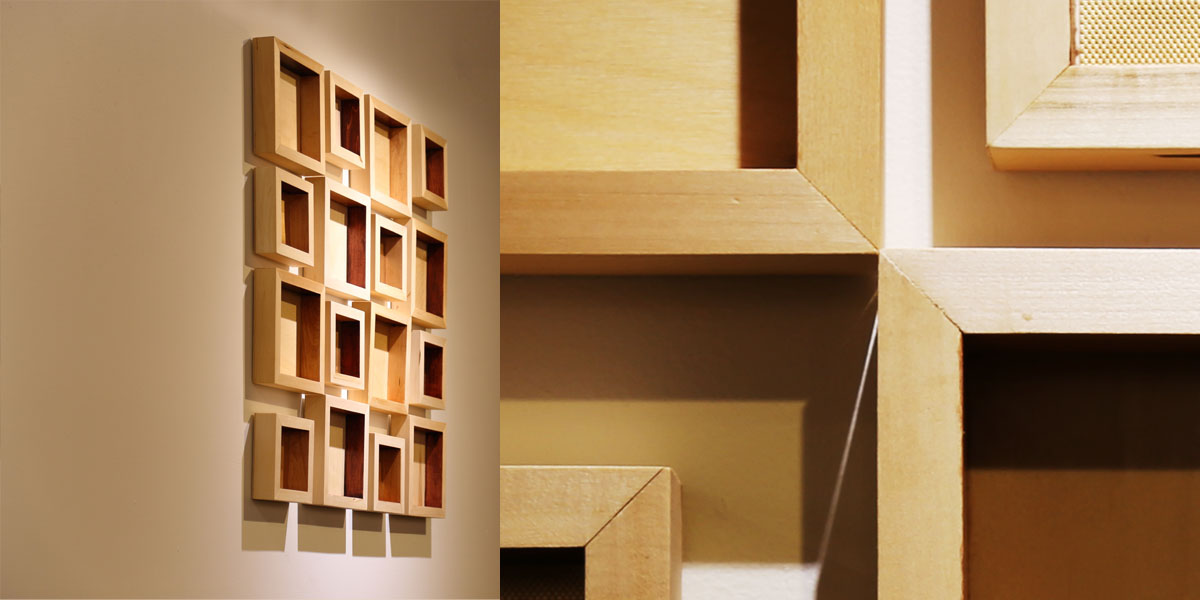
Blurring sculpture and painting, these wooden volumes reveal different patterns of color and shadow, particularly from oblique views
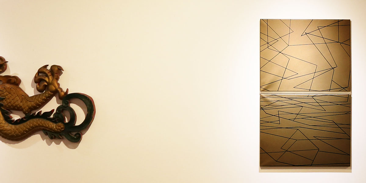
Paintings by s!fan reference traditional Chinese garden screen patterns, as well as the line drawings of Connecticut artist Sol Lewitt. Traditional spatial representational elements of a horizon line and foreshortening create the illusion of depth, which recalls the original windows along this wall
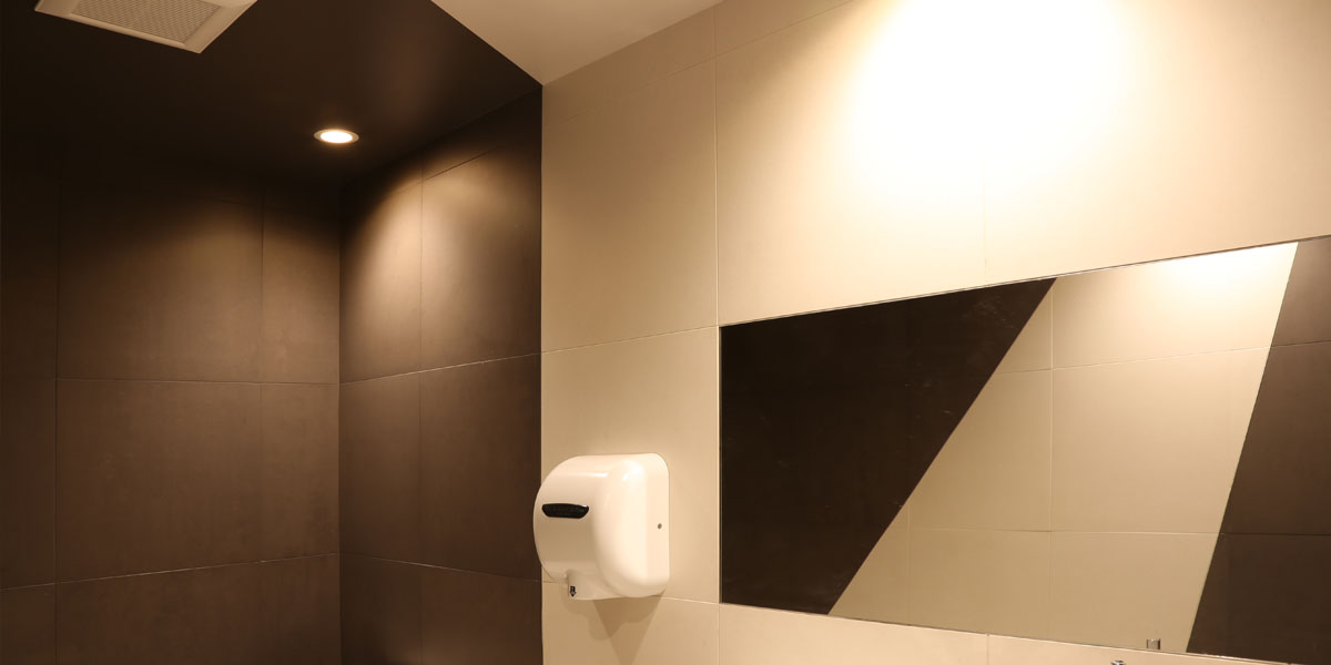
Bathroom tiling reiterates the Chinese paper folding forms of the hallway and exterior entry
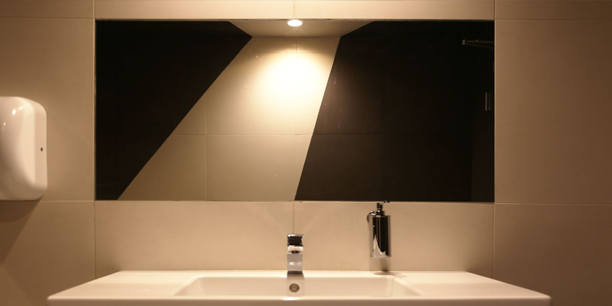
Dual symmetries formed by grout and fixture alignments are balanced with the dynamic assymetrical bi-colored tile design